
Origin of the name flickr: flicker.com was taken
This isn’t really hot news, but it was news to me when George Oates mentioned it in passing during her piece at Dconstruct 07.
In an age of curious-sounding Web-site names, “Flickr” came largely by accident. The domain owner of “flicker.com” wouldn’t sell, so Caterina suggested “Flickr,” which Butterfield says made the service stand out. “We always had to spell it out for people, which helped make it stick,” he notes.
[read more]
Unsurprisingly, correctly spelled domains get loads of hits from people who don’t know how to spell web 2.0 brand names, and assume that the correct spelling would be the right way to do it.
So if you mis-spell your brand name just for a bit of ‘web 2.0 distinctiveness’, are you really doing yourself any favours?
After all, just two weeks ago, Del.icio.us decided to make the switch to delicious.com. How very sensible.
Tickling our 'novelty bone'
An article in the Guardian last weekend (01/09) gave a disappointingly narrow view of 'good design', missing an opportunity to demonstrate design that supports modern social challenges. Instead the article focused on aesthetics, creativity and novelty - important, but not exclusively so.
The '50 best' selection included practitioners known for creative lateral thinking (e.g Thomas Hetherwick). Much of the featured work is clever and creative and aesthetically ground-breaking. Other work is novel or witty or classic or otherwise interesting.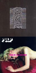
These expressions of creativity perpetually take the limelight over designers or agencies or companies that use design to directly address contemporary challenges. It is worrying that this old fashioned view of design prevails.
Missing out is a design that looks to directly improve quality of life, rather than amuse or provoke intellectual exercise.
Into this category we could fit, perhaps, user-centred agencies looking to improve lives by encouraging industry to create better things. But could also include the likes of Hillary Cottam, who applies design to improve health and education services, Dot07 who bring together designers and thinkers to discuss contemporary issues or for celebrity cachet, Wayne Hemmingway who is, after fashion design and punditry, addressing the insanity of the product packaging industry. Doubtless there are others.
I'd have thought the time was right to consider carefully the design 'trends' aligned with contemporary challenges. I found the article supported a version of design that didn't need the attention and didn't tap into a contemporary reflective mood where manufacturing, consumerism, sustainability and ultimately, for me at least, design are in the dock.
Article: http://arts.guardian.co.uk/art/design/story/0,,2159165,00.html
1 commentFlow project: Penguin and Dorling Kindersley launch new websites
Penguin Books and Dorling Kindersley have just completed a user-centred re-design of their websites. We're pleased and proud that they chose Flow to work with them on the projects.

Penguin and DK's teams told us that they wanted to do some significant rethinking about the purpose of the sites, and the needs of target users. We started with contextual research to build a genuine understanding of what target users need from publishers' websites, and to examine the user experience offered by the current Penguin and DK sites.
From there, Flow conducted workshops to help the teams work out a new user experience strategy, build personas and scenarios and create new site concepts. We consulted to the in-house design teams during the detailed wire framing process, conducted the usability testing, and provided information architecture support for the new facetted classification engine.
Anna Rafferty, Penguin's digital marketing director, has written a blog post about the process.
"Months of workshops, designing, testing and re-designing later and we're happy that we've shifted our site from being a company on broadcast to being genuinely reader-centric."
And Jeannette Angell, Penguin and DK's online development manager has just been interviewed about it by e-consultancy.
"If there's anyone reading who hasn't yet sat behind mirrored glass, watching your visitors try and fail to do what seems to you to be the most obvious task, I urge you to experience it. The lessons learned from this experience can be staggering!"
Congratulations to everyone on the Penguin and DK teams on embracing the user-centred approach, and delivering the sites after so much hard work. And thanks for working with Flow!
No commentsiPhone: A whole new chapter in user experience
I had the experience: 20 minutes with an iphone. Thanks to Gary Marsden for the opportunity.
People have said “oh yeah the iphone is really good.” Some have said “It’s really REALLY good.” But I thought they were just Apple groupies.
They didn’t convey just how good it is. It’s astonishing. My jaw dropped. And when my wife tried it, her jaw dropped too.
Now I’m an Apple sceptic. I find Apple devices rarely live up to the hype. So this is not an Apple-worship post.
This post is about how the iPhone is ushering in a dramatic shift in the world of user experience.
Adding more feel
There’s a term that bobs around in the world of technology: “look and feel”. Look gets most of the attention, and often, feel is something we struggle to define.
That’s because most applications feel the same. We click buttons, we slide scrollbars, we press keys. Nothing has really changed in years. And we reached the point where we all forgot to look for alternatives.
What’s special about the iPhone is the feel. You use it by making gestures, and touching it with several fingers at once. You flick at long lists to make them scroll fast. You pinch photos to make them smaller and stretch maps to zoom in. You don’t just interact with an iPhone. You conduct it. You play it. You treat the things on the screen like real-world objects (slightly magical ones). Using it is a great experience and I really urge you to seek one out and have a go.
(Yes I know it’s not perfect. It’s no good if you need to operate it by touch alone, it requires two hands, and it requires us to use our thick and clunky fingers. But that doesn’t stop it being amazing).
With this new kind of user experience, we’re inching up through the spectrum - towards fuller, more engaging, experiences. We’re still miles from the rich, real-life experience of a fast drive in a luxury car. But we’re closer than we were.
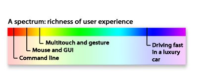
That’s cute, you say. It takes feel to a new level. But so what?
Well, this new kind of user experience will have a very real impact on our lives and the digital technology business.
A step-change
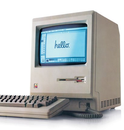
Think of it this way. In 1984 there was a small grey box with a mouse and some basic GUI capabilities: the Apple Mac. Humble, yes. But it was the first commercially successful GUI computer. 23 years later hundreds of millions of GUI operating systems are installed across the planet. And that has enabled us to build at least a couple of new industries, and transform the global economy. That’s right - we couldn’t have done it with just the DOS prompt.
The history of the internet is another great example. Only when the first graphical web browser, Mosaic, brought images and clickable hypertext to our screens, did the internet was finally go mainstream.
A change in the way we use computers - allowing us to do the same things better, and tackle new things we haven’t yet imagined. Explosive growth. Life- and economy-transforming results. The iPhone is the beginning of another round of that.
What kind of company that can make things like that?
As Harry Brignull and Bill Buxton have both pointed out, Apple stood on the shoulders of giants to make the iPhone. Multitouch research has been going on since the early eighties. The games industry has been making use of gesture and natural physics for years now. And smart phones have been around for a long while.

What Apple did, though, was to throw out one heavily-entrenched assumption: that phones had a keypad, a yes, a no, and two softkeys. Once they did that, they gave themselves a new opportunity to pull together a range of ideas and technologies into an amazing device.
For that they deserve enormous respect. Very few organisations in the world can throw out that much inherited wisdom, and demonstrate that much innovativeness, foresight and guts. Many wish they could. But for most, the risk seems too great, the politics and processes are too stodgy, the desire to just get something “good enough” out there is too strong. (The trick: follow a user-centred design process to de-risk your innovation projects.)
Who dares wins…
Well, it looks like Apple will sell 6% of the coming year’s smartphones. And Microsoft, will sell 5%, even though they have been in the market for years with Windows Mobile and Pocket PC. That tells us something.
But whatever happens to the iPhone, we can be sure that multi-touch and gestural interfaces are going to change the experience of using computers forever.
A balanced user experience starts with the box
A box that many people can't figure out how to open without a Google search is an unusually pathetic failure of design.For those of you who want the full details, my colleague Karl Sabino has dug out the official Microsoft help page for opening the box.
Balancing easy, useful and delightful
Microsoft have recently been talking about the importance of the aesthetic quality of a good user experience. Good for them. It's very important. Beautiful products make us more likely to try them out and, by putting us in the right frame of mind, make us more effective at actually using them. But this box seems to illustrate the problems of going too far towards the aesthetic, and forgetting the easy/useful part of the equation. It's cute, groovy, cool - but it's a pain to use. And that's not a balanced user experience. That's where the web was back in 1998, and we all thought things had moved on since then."It's a business requirement"
Maybe the box is hard to open for business reasons. Perhaps its some anti piracy measure or linked to the licensing agreement. That's no excuse. If a business "need" inconveniences customers, it needs to be re-thought. Why? Because if you treat your customers badly, they'll treat you badly - asking for additional expensive support, requiring heavy marketing expenditure to avoid churn, damaging your brand with negative blog posts. Which all cost you money in the end. In the words of Colin Shaw, "You get the customers you deserve."Patching the hole
One thing that Microsoft have done right: issued a "service patch". They know there's a problem with the customer experience and they've done what they can in the short term to take the edge off the problem. They've published a web page. The next step is to stick the instructions to the box, so that you don't have to search the web to find them. No commentsThe difference between good and bad writers.
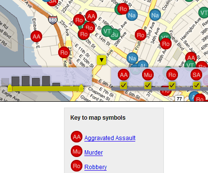
Good user experience: Oakland crimespotting website
http://oakland.crimespotting.org
Crime database websites are nothing new, and I wonder how helpful they really are to people. Does access to this information empower you, or does it create an atmosphere of terror which within which the state is free to curtail civil liberties?
Whatever, the interaction here is simply grand.
New Flow Interactive site launched!
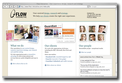
Finally we’ve managed to get our new site out the door. Please do drop by and take a look. In case you’re wondering, Flow interactive is a London-based User Experience consultancy. I’m a consultant there. We’re hiring.
By the way, my posts from this site (90percentofeverything.com) will also be appearing over on the flow blog.
A new website for Flow
We're proud to announce the launch of our new website at www.flowinteractive.com.
The old one had been around since about 2001, and it was definitely time for a change. We think the new one does a much better job at presenting what we've gown up to be over the last ten years.
It's been a long time coming - partly because we've been so busy helping all our clients build their websites. But the stuff we're learning every day about user experience is valuable and we're hoping to use this website and the blog to share some of it. We plan to add more case studies and, in time, publish downloadable articles about some of our principles, techniques and insights.
Thanks to everyone who helped with the project, from both inside and outside of Flow. It was an honour to work with such a great range of talented people.
No commentsThe journey IS the destination
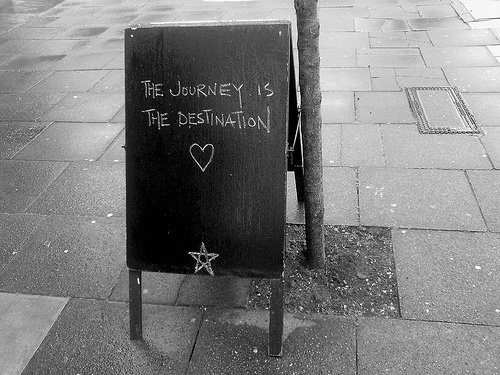
This should be the mantra for user experience designers everywhere.
Image stolen unashamedly from Jonny Baker’s Photostream. The concept came up in a chat with Simon Johnson today over lunch.